Client background
Carvinz is a company with advanced cloud platform built to accelerate business growth. they empower restaurants and cafes of all sizes with the tools they need to compete with industry giants without the complexity that typically comes with cutting-edge technology.
Problems Faced by Users
Long queues Accessibility concerns in current system Downtime and malfunction Long Wait time due to complexity Unclear instructions Difficulty with navigation Overwhelming options makes delays in decisions
UX design process
I defined the design process based on Double Diamond Theory. Used the agile method to discover, define, ideate, implement and repeat the process again and again to refine user experience.
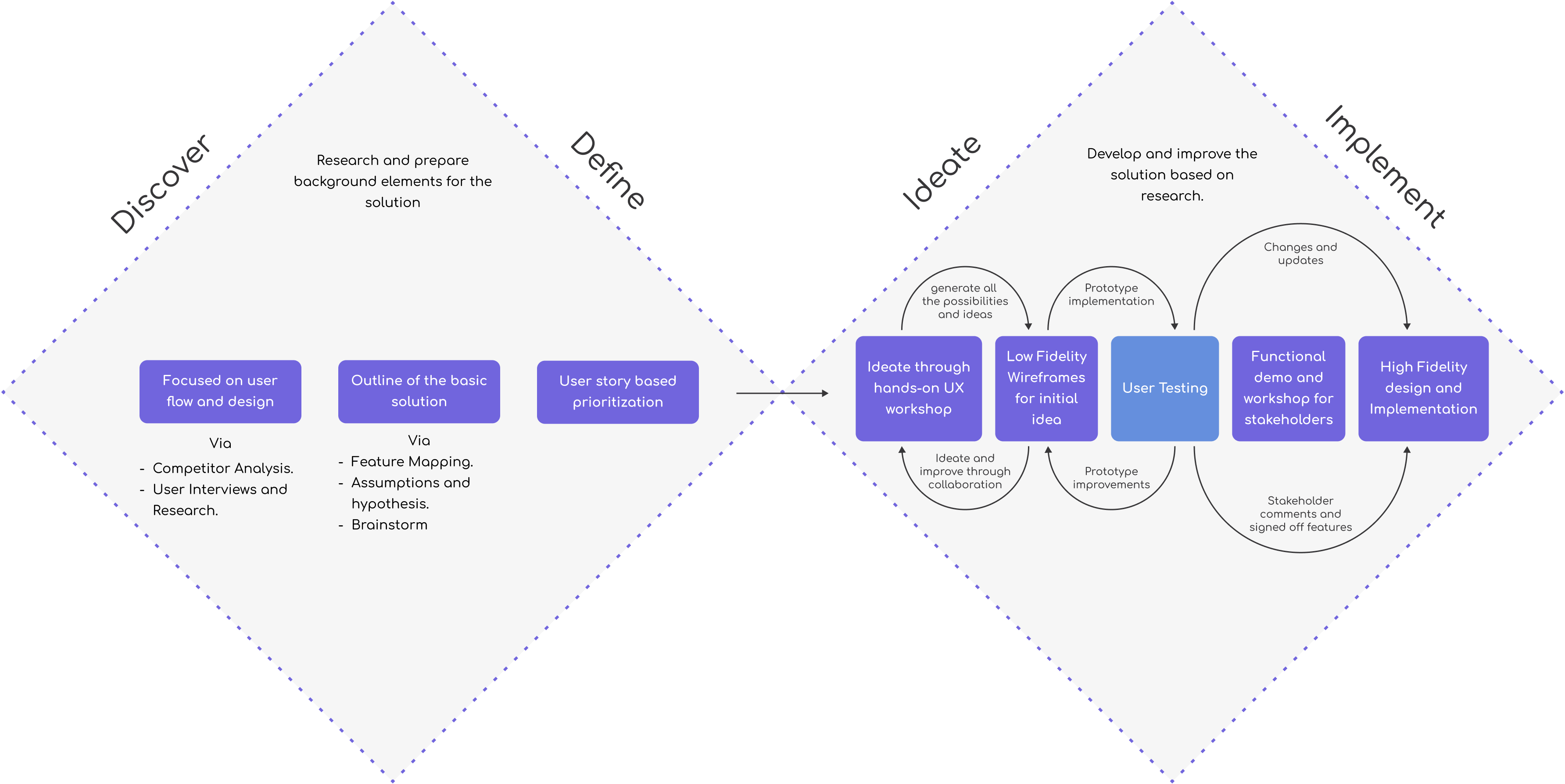
Agile: Research, Ideate, Wireframing, Designing & Prototyping
Developed low-fidelity wireframes to outline the basic layout and flow. Created high-fidelity prototypes incorporating branding guidelines, interactive components and tested the user flows with high fidelity prototype.
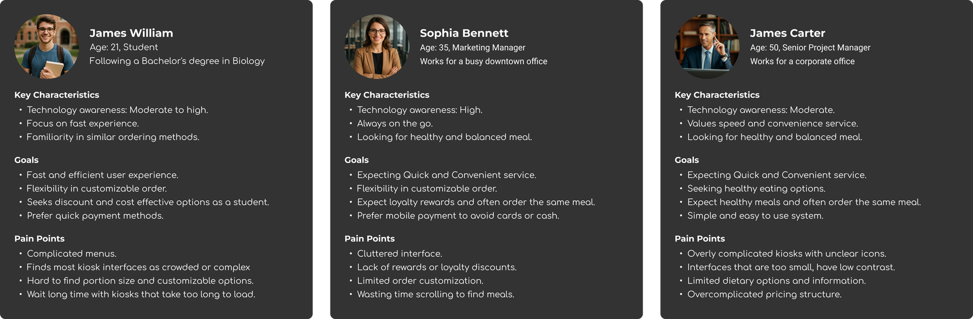
Interviews & User's Perspectives
I defined three user personas to cover three Millenials, Seniors, Professionals to capture and gather insights from all age groups.
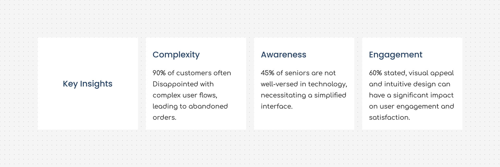
Key insights
After defining personas and conducting interviews, I have successfully mapped users to their respective key insights to solve real-world problems.
Interviews revealed a simplified service as the key insight and other key findings are placed around it as required elements.
More findings from the research
Need a simplified menu and categorizations Seek flexibility in customizing order Wanted to highlight healthy options Required fewer steps to complete order Loyalty or promo code option Multiple payment methods Accessibility feature
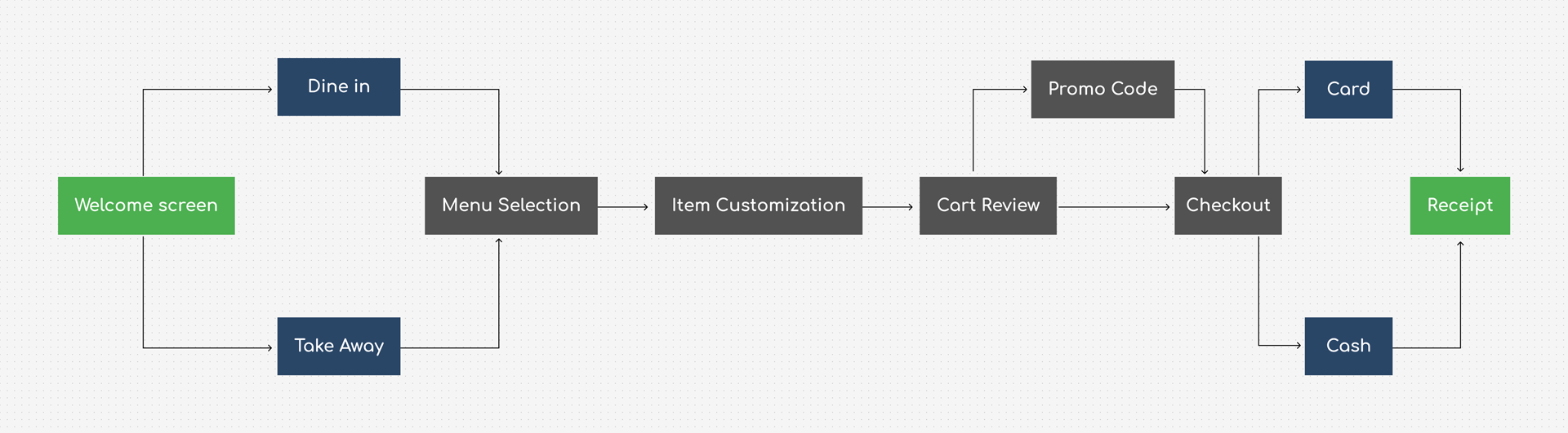
User flow diagram
To outline the basic solution I created a user flow diagram that mapped each user type to their user journey, with their respective key insights.
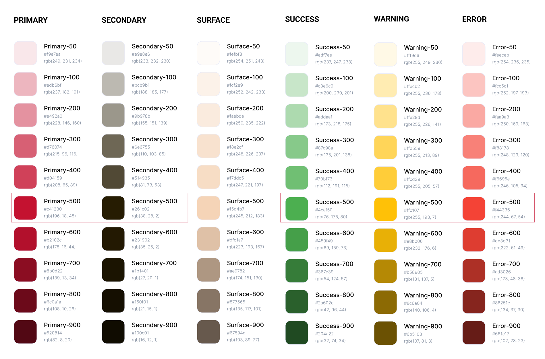
Color palettes and Figma components
I have added primitive color palettes and used them as Figma design tokens. As my research goes on, I have finalized the smaller CTAs components inside 60px to 70px height range to make it more user friendly
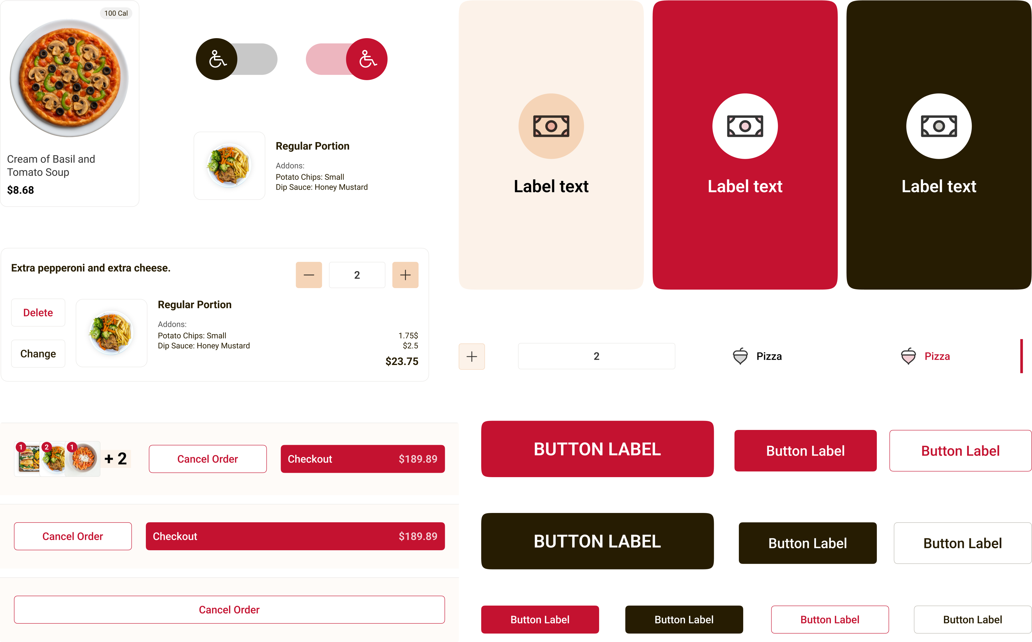
A summary of the components I developed using the Atomic Design methodology, ensuring they are modular, expandable, and reusable for future scalability and consistency across the product.
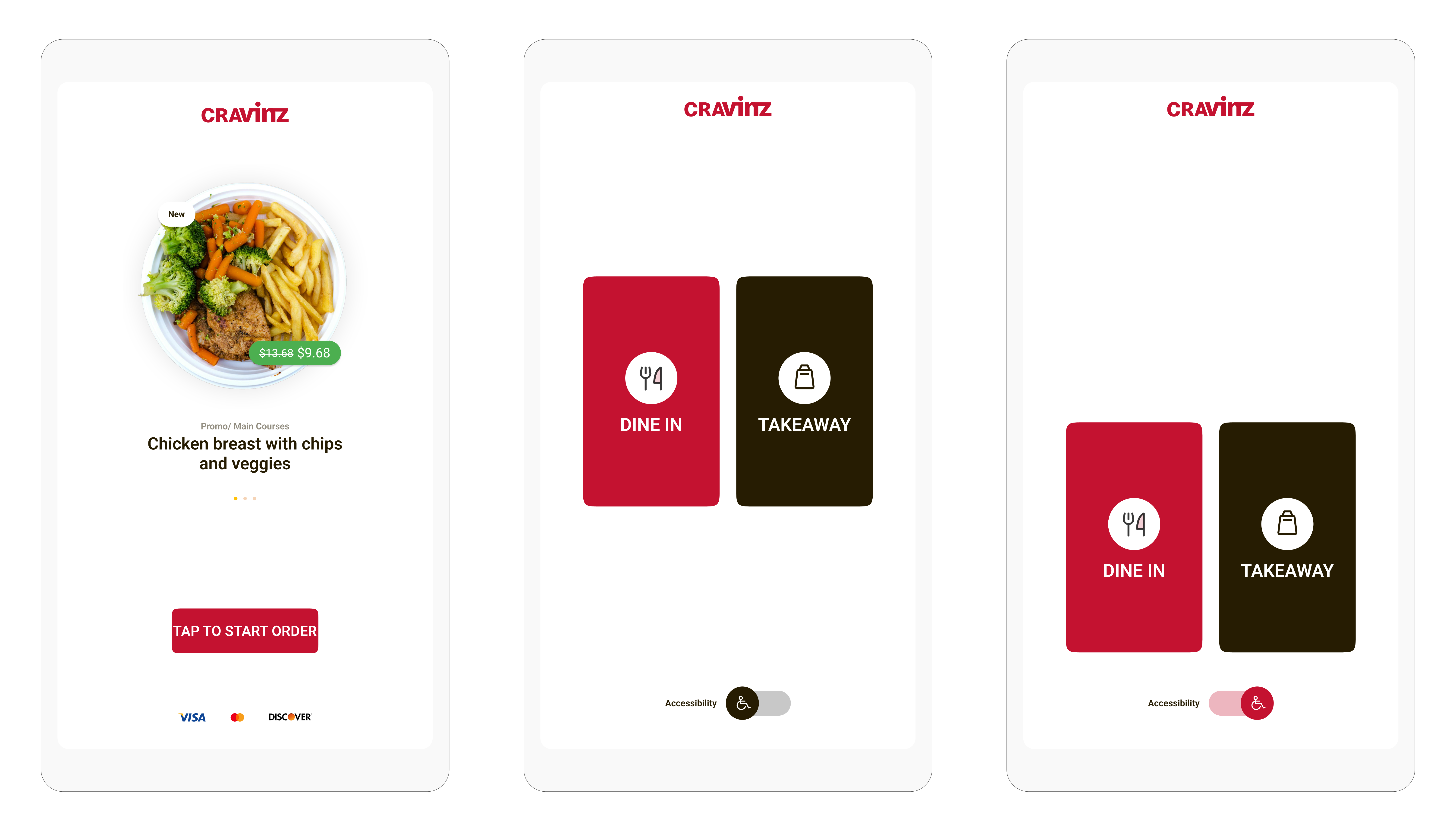
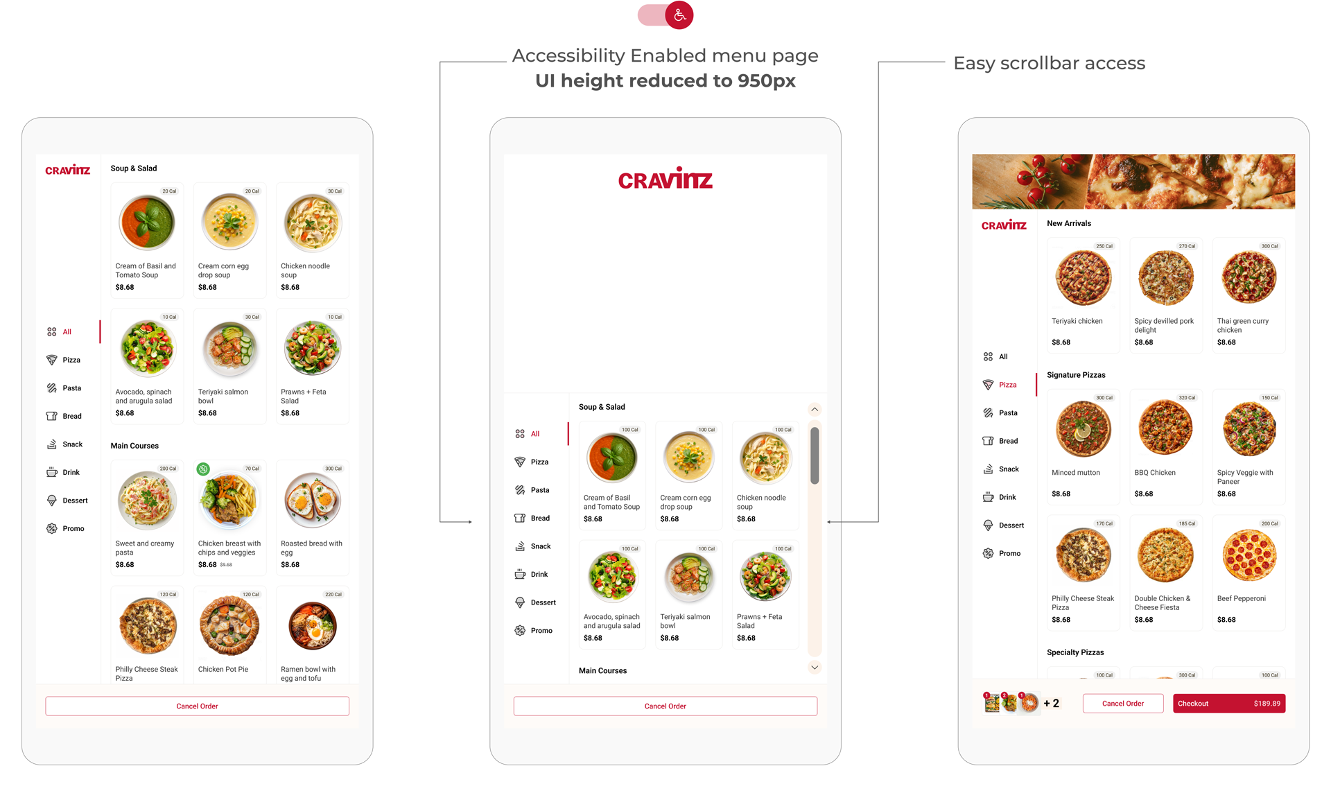
Accessibility feature
After conducting interviews with restaurant management to gather insights, I identified that incorporating accessibility features is essential in the final solution.
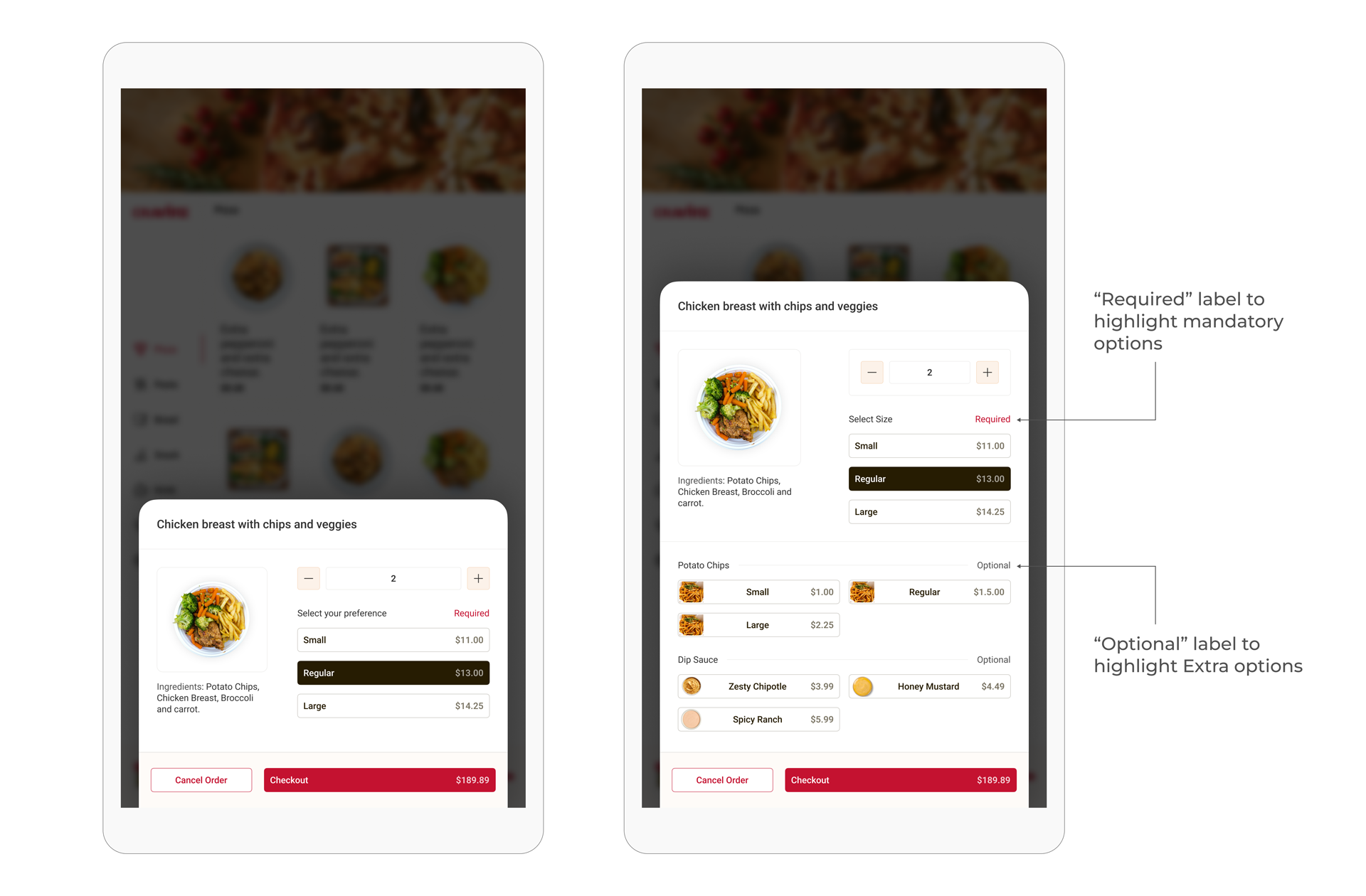
Simplified layout for complex selections
As identified in the research, Users wanted a clear view of the portion and the price. By highlighting mandatory options I have managed to get rid of accidential input of extra toppings and items.
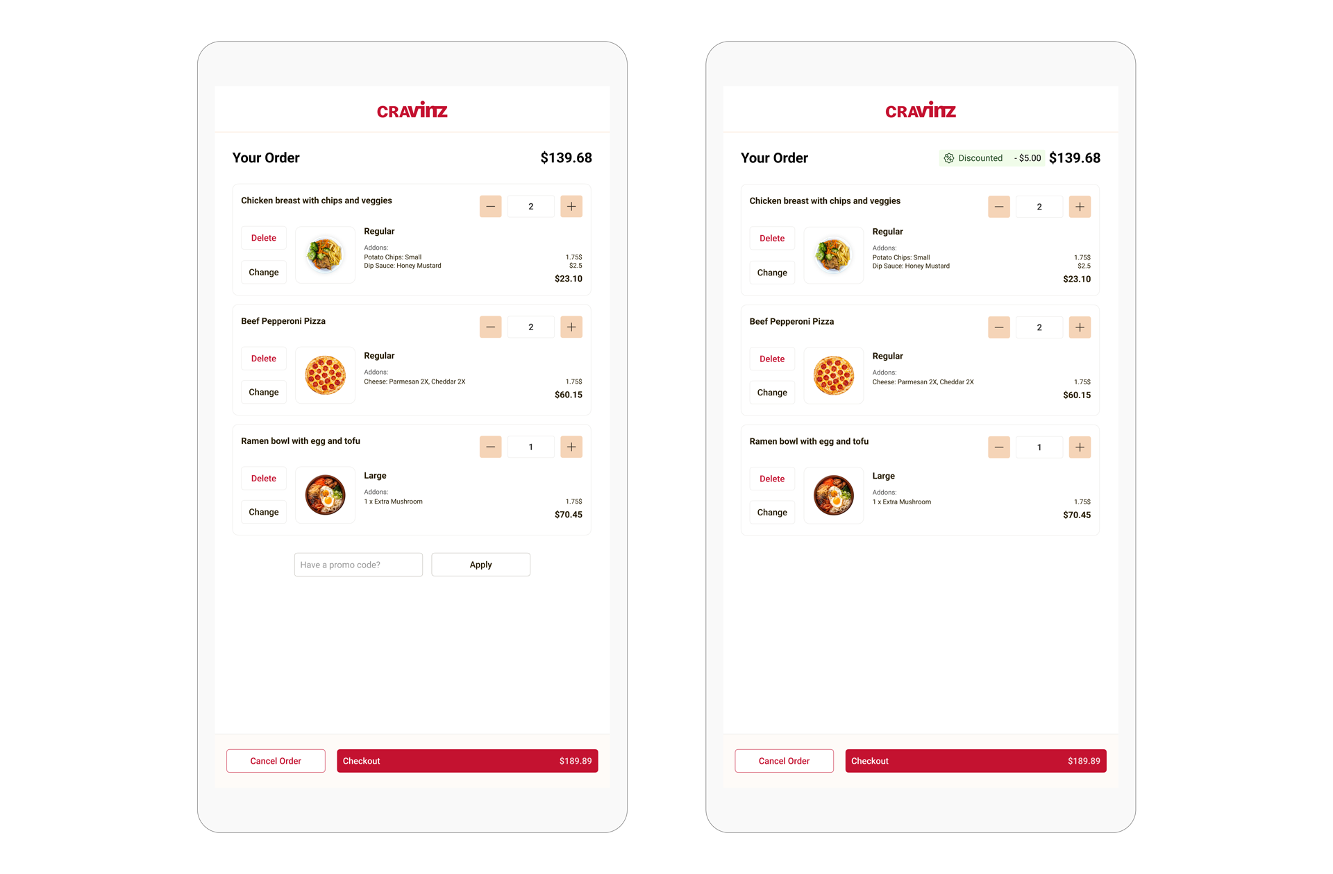
Informative and simple shopping cart experience
The creation of the shopping cart redesign which included the straightforward promo code entry system led to a 20% increase in promo code usage while simultaneously reducing cart abandonment by 15%.
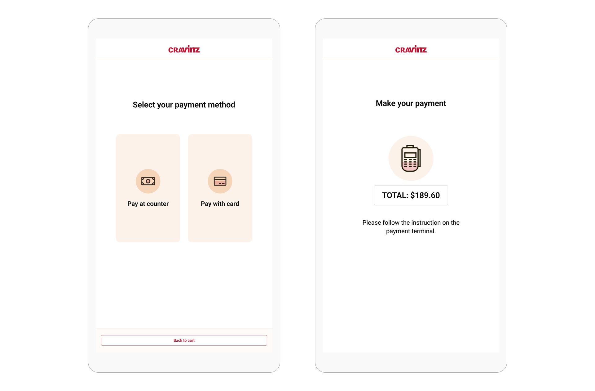
Pay at the counter and pay with card options included in the payment process. The card payment machine (payment terminal) placed right below with clear instructions to use.
Research oriented cart design
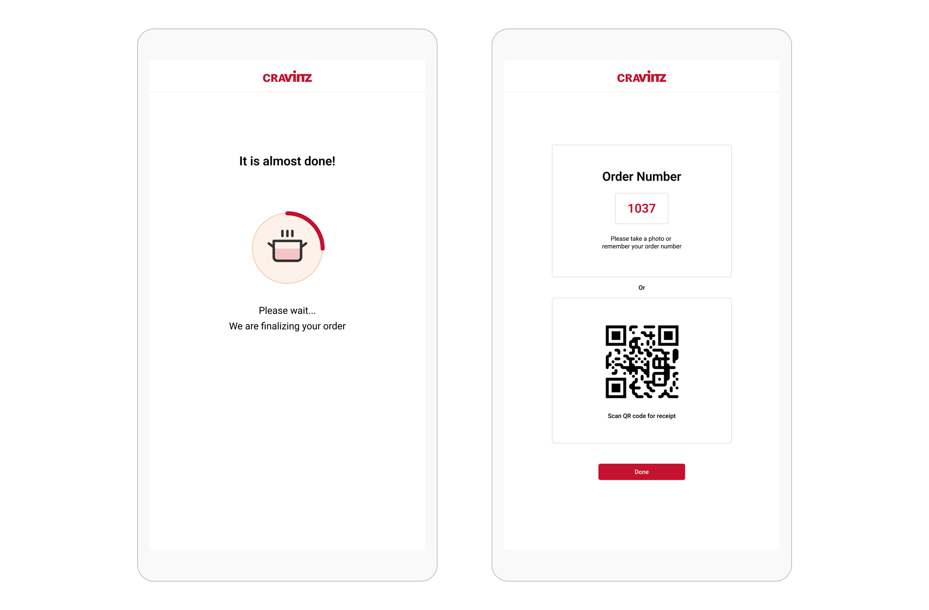
By adding a clear loading indicator, multiple modern receipt generation options and simplified design, enhanced the user experience.
These designs went through a series of changes.
My initial designs went through several internal/ external user tests, discussions with Product, Sales and Marketing teams to make sure we have a user-friendly, simple and scalable user experience.
I wish if I could show you every change we've made to fine tune!
Project impact
Within just 3 weeks after deployment, the kiosk significantly improved order accuracy, reduced queue times, and increased customer attraction during busy periods.
67%
Reduction on average ordering time compared to previous version.
45%
increase of kiosk usage and attraction during busy periods.
91%
increase in 5 star ratings from daily and new customers.
What's next?
As we gather user feedback, we plan to conduct additional rounds of user testing to refine and optimize the design.
- A/B testing to determine and refine navigation structure and layout changes.
- Expand the testing pool in more regions to identify demographic specific features.
- Include a quick login option to introduce order history, loyalty rewards and other account based features.
- Accessibility: A feature that allows user to scan QR code and load kiosk on their mobile phones.
What I learned
Stacking everything in one view to accomplish business goals won't draw user attention. Maintaining application efficiency and improving user engagement to support product growth requires user segmentation, visual clarity, and order process optimization.